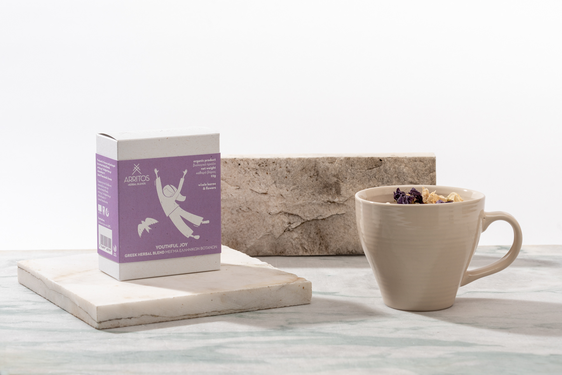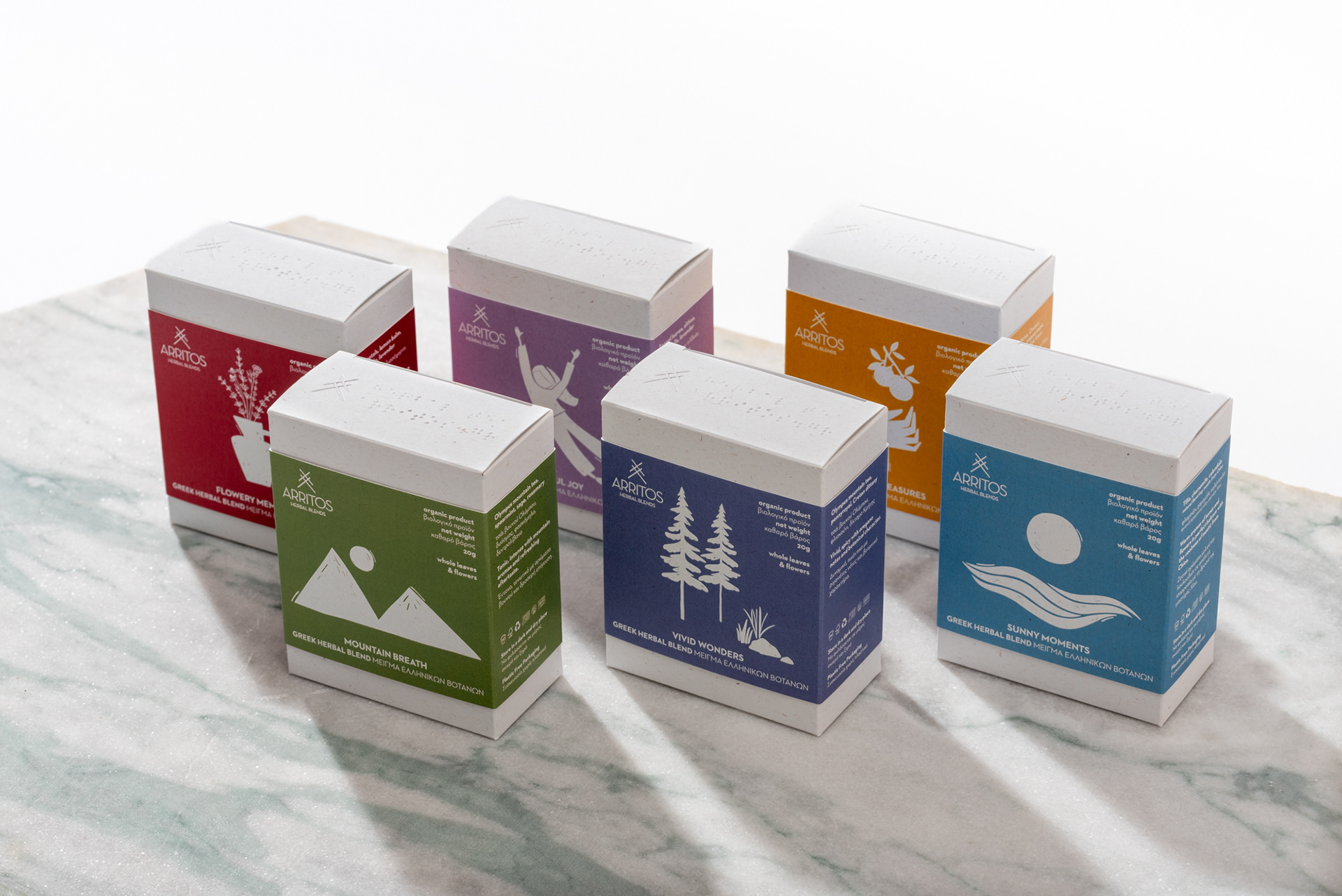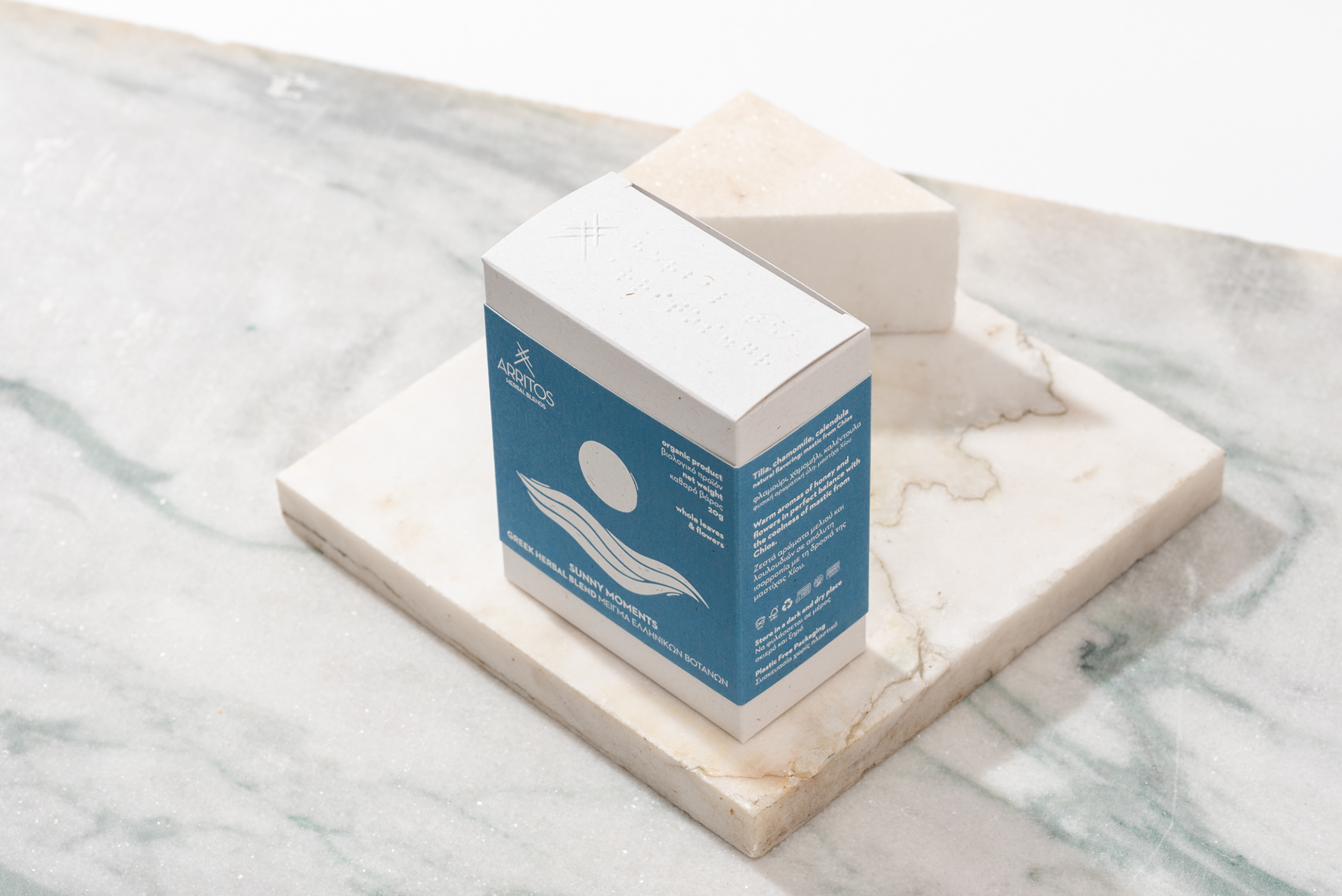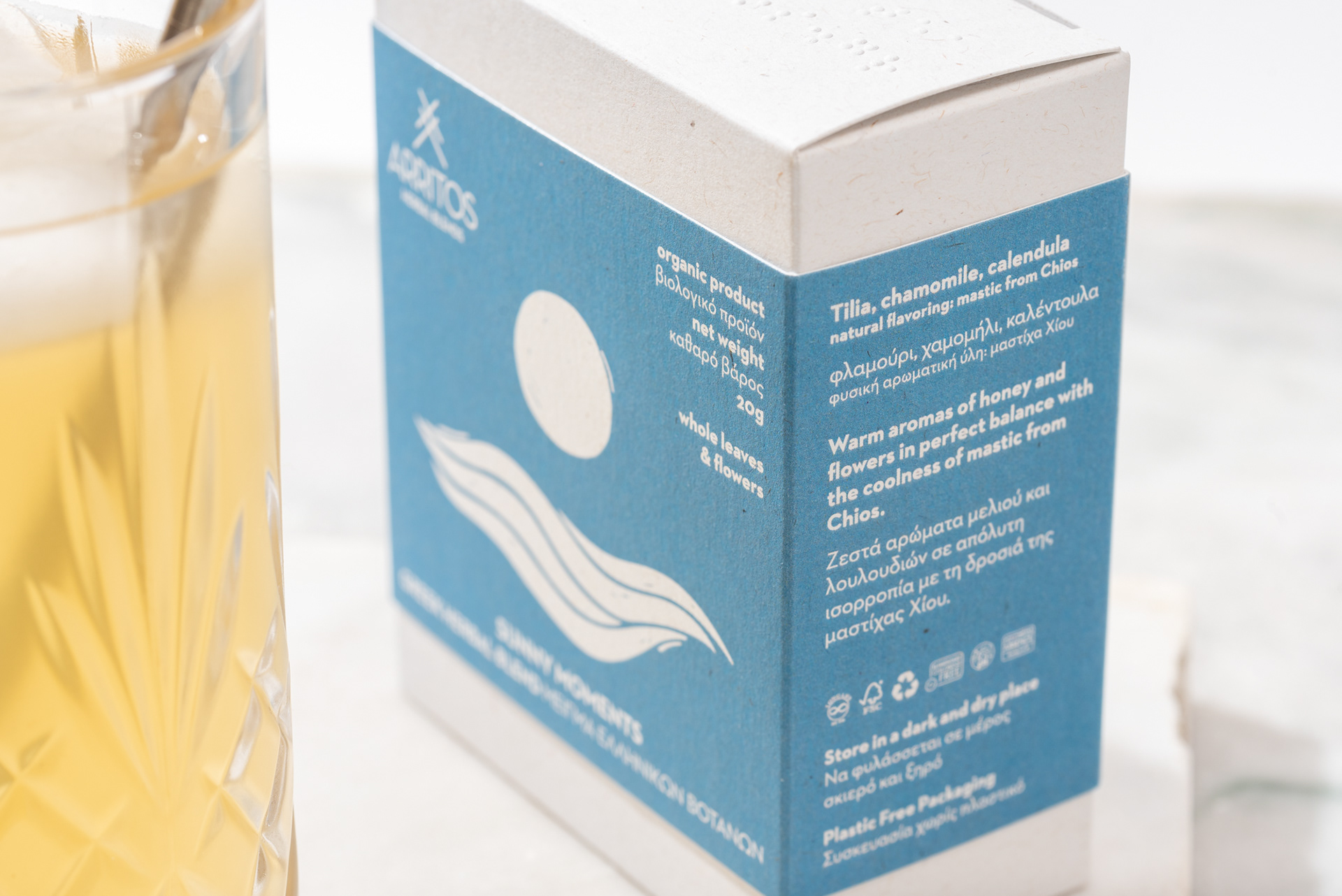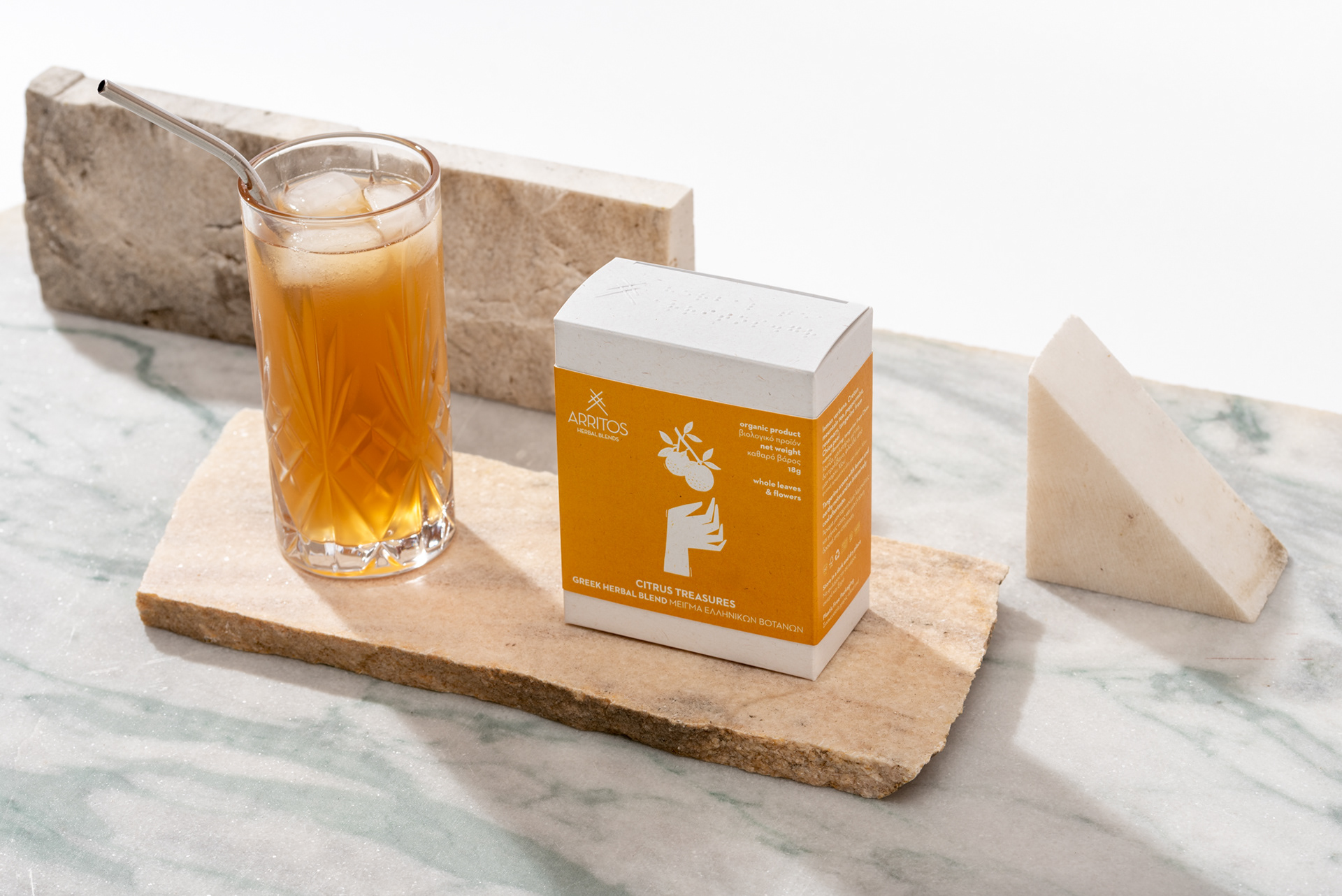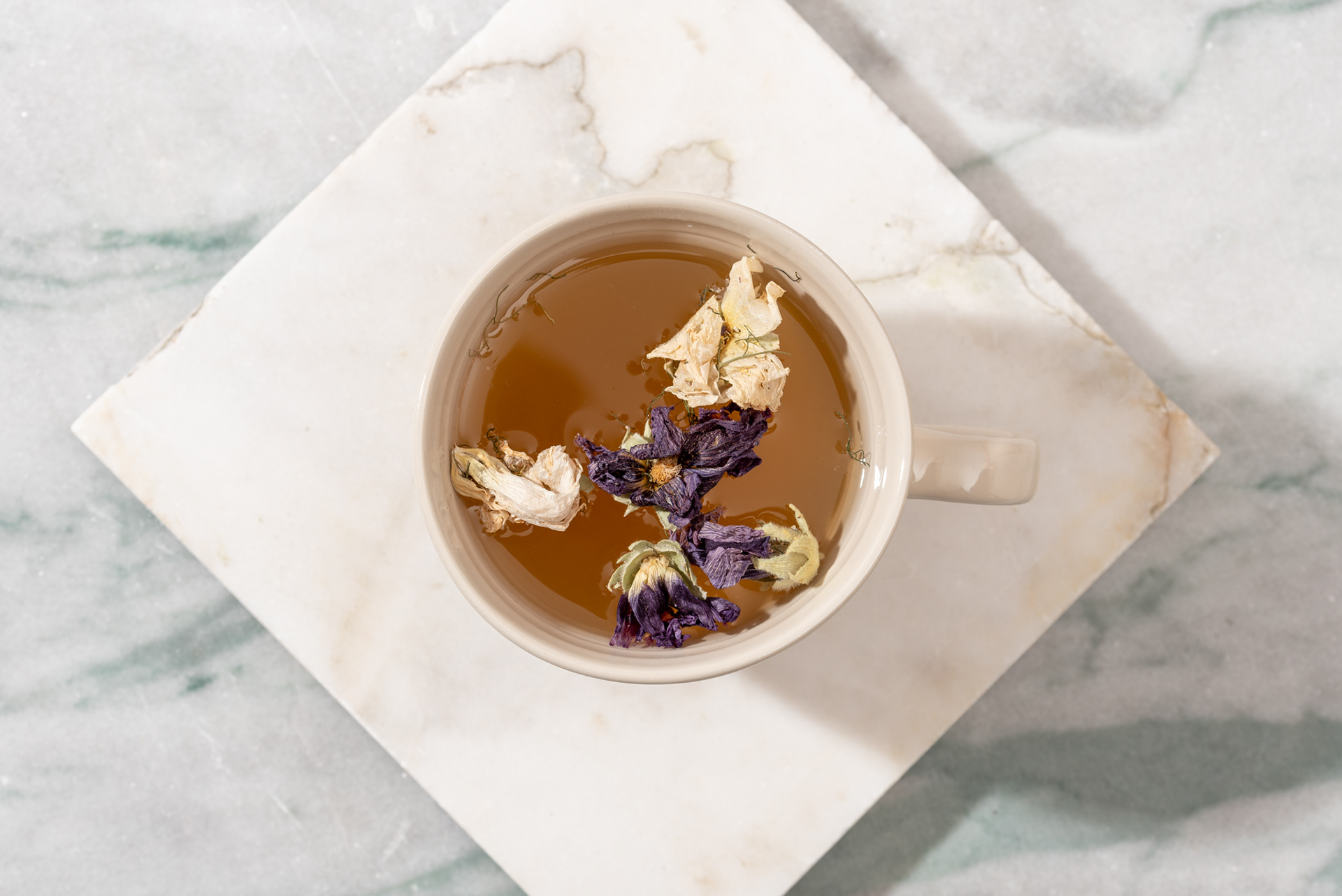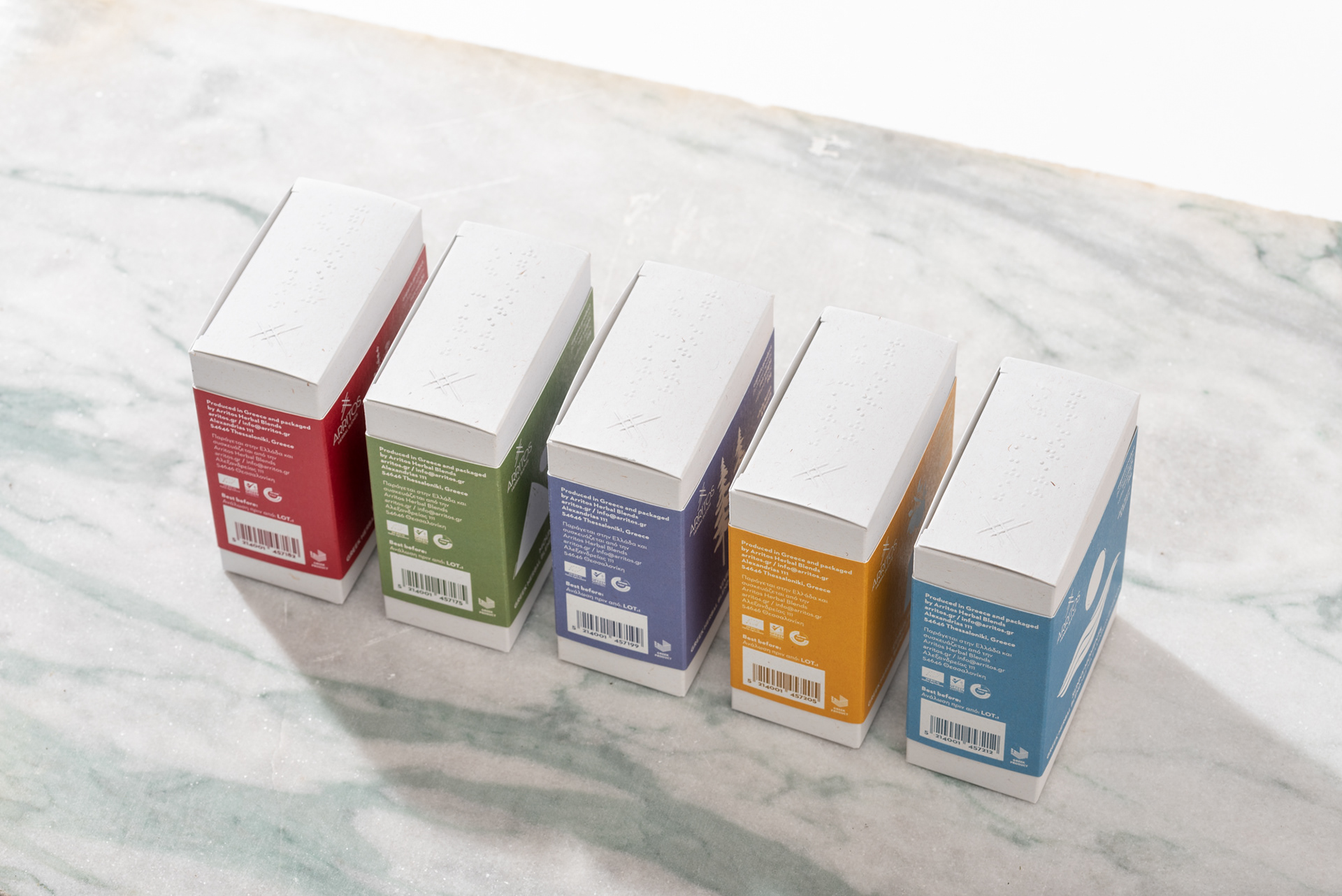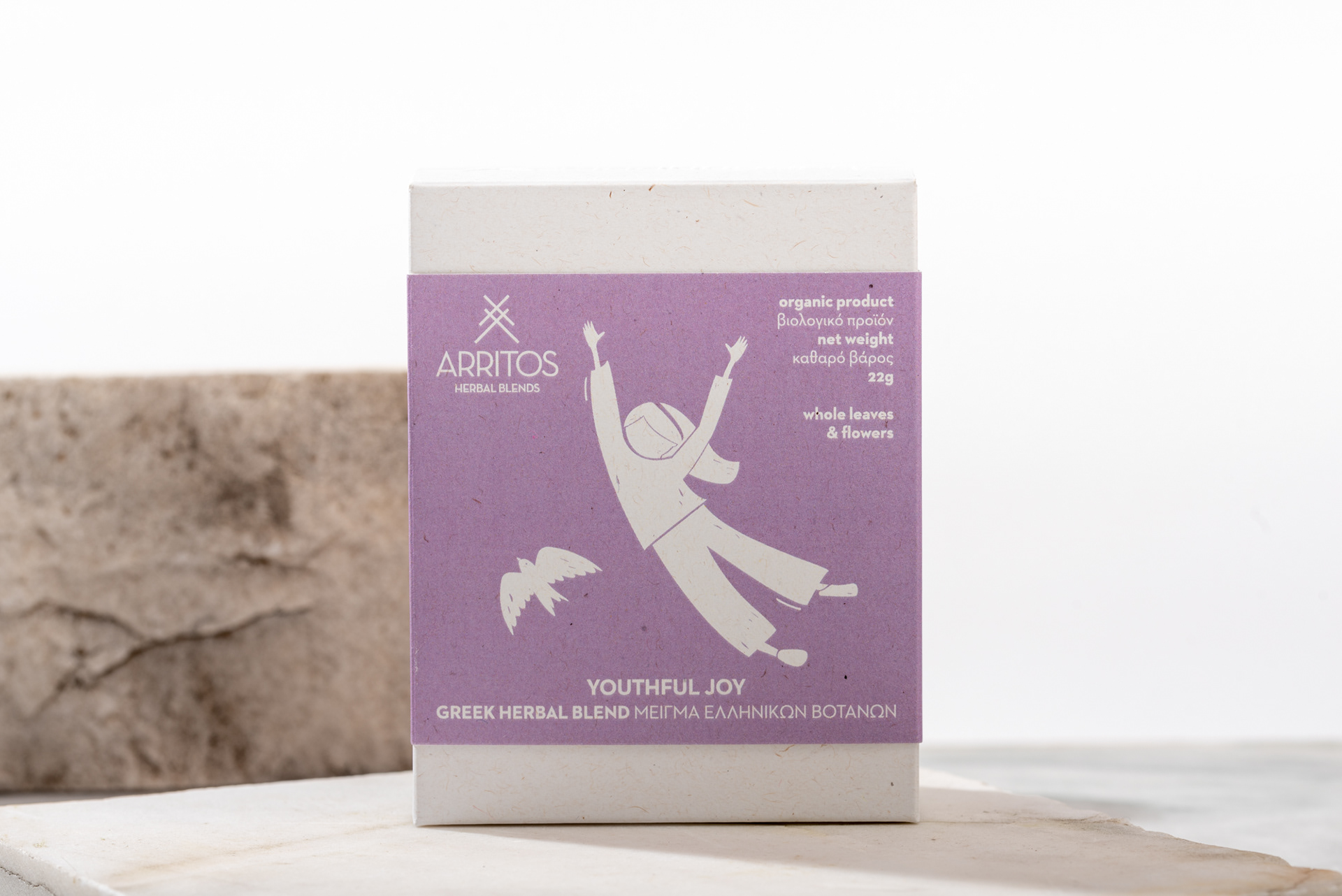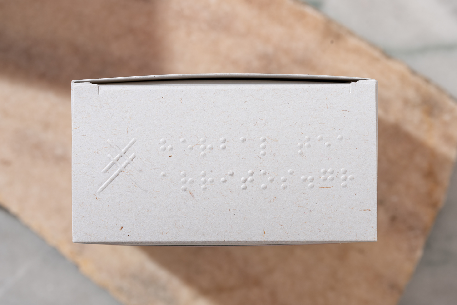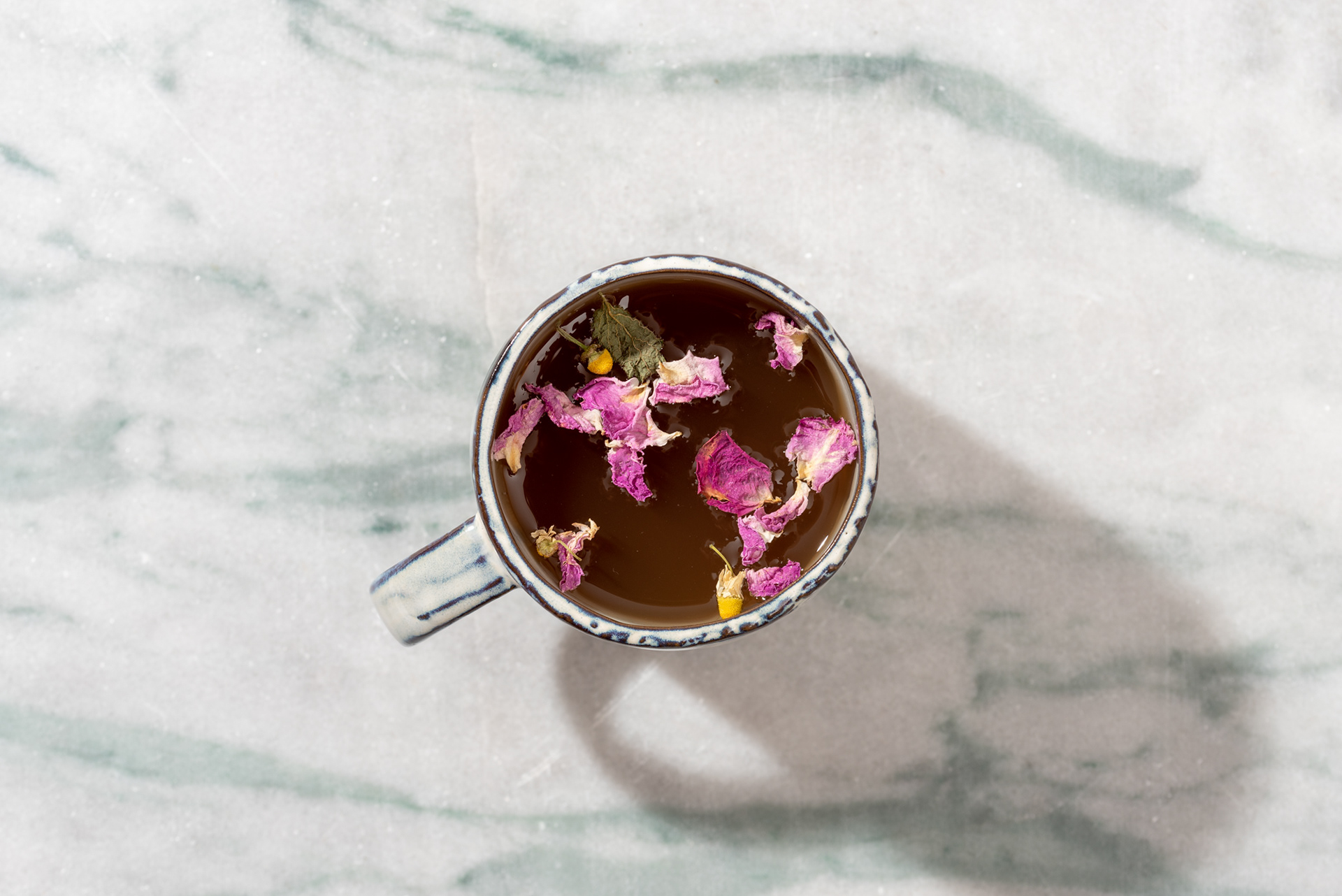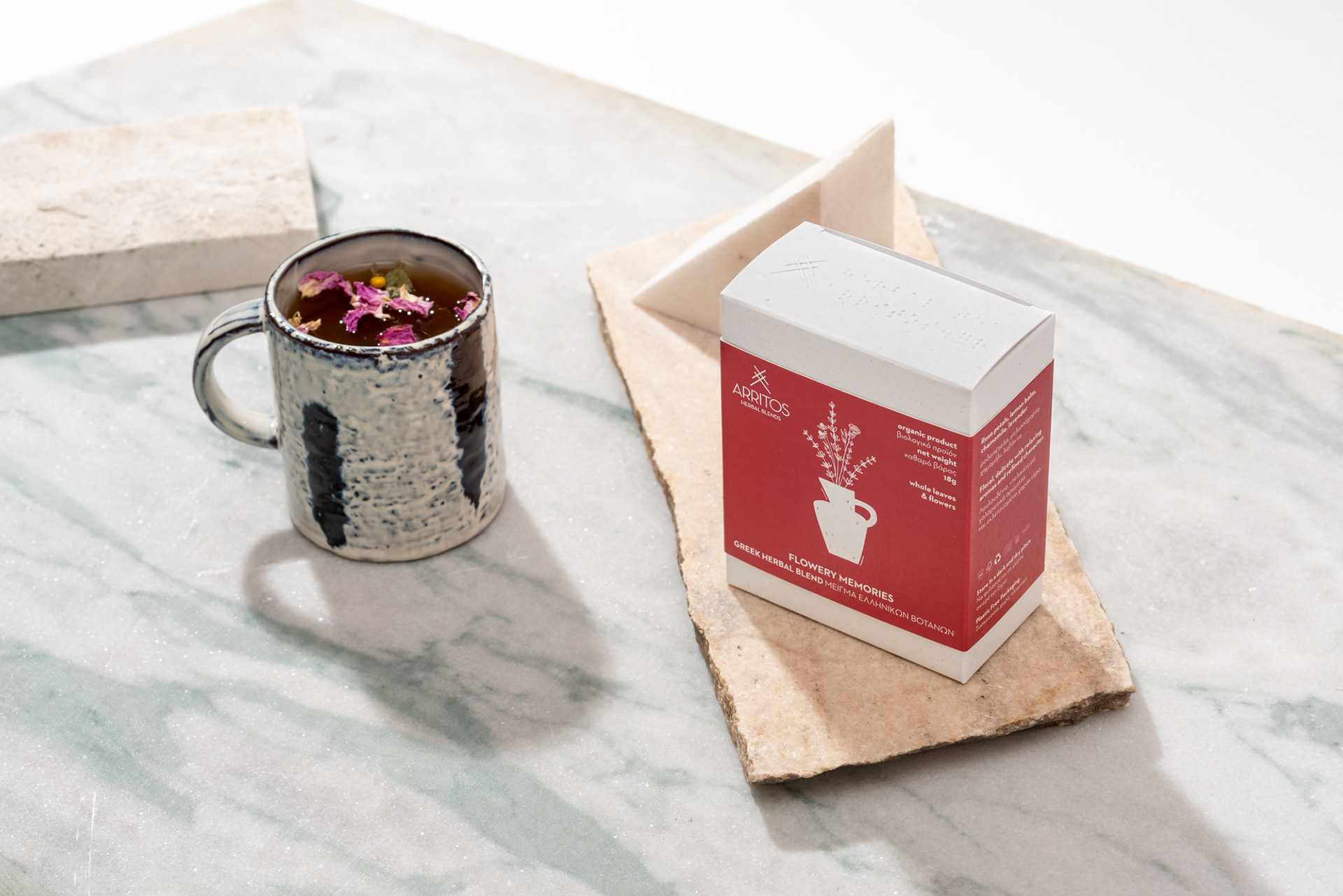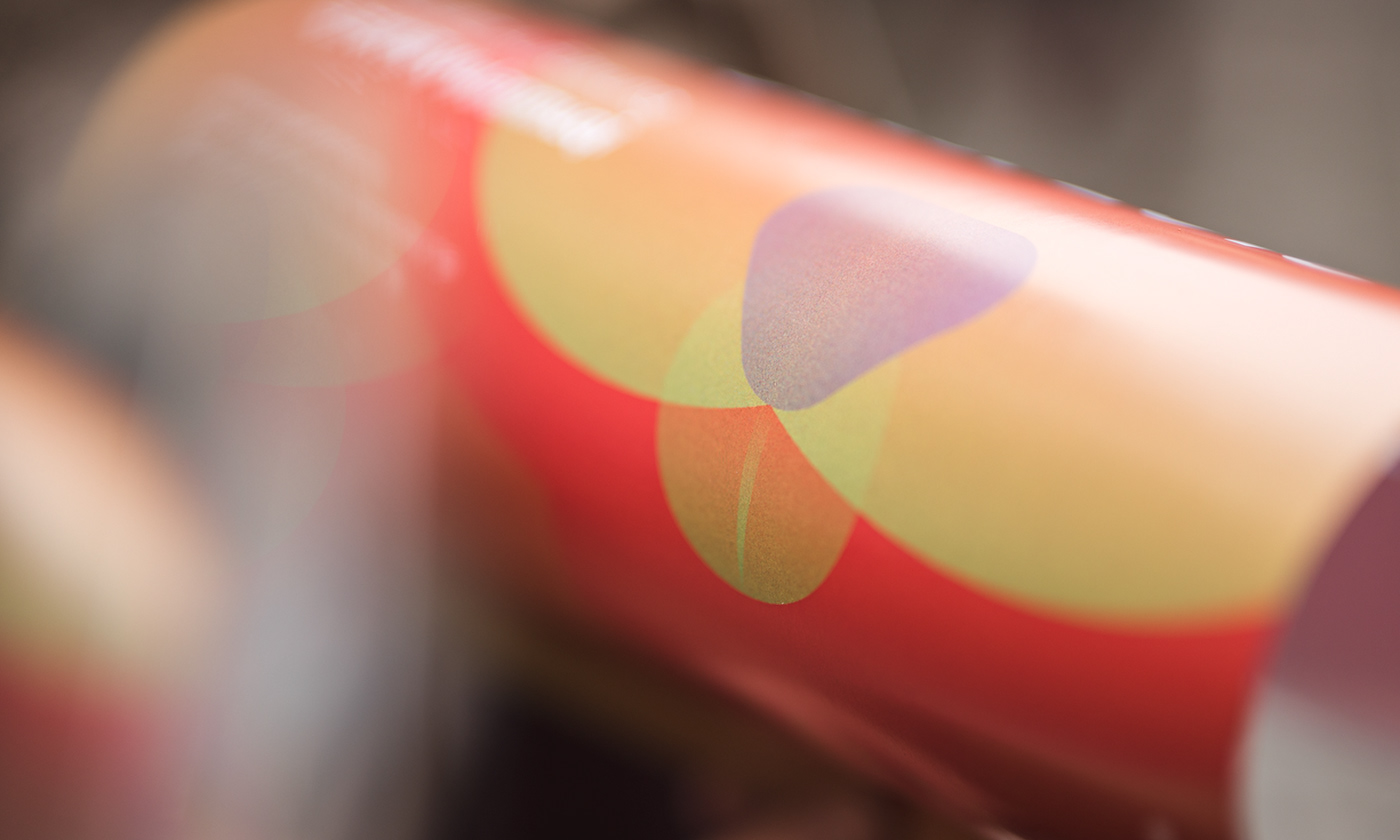

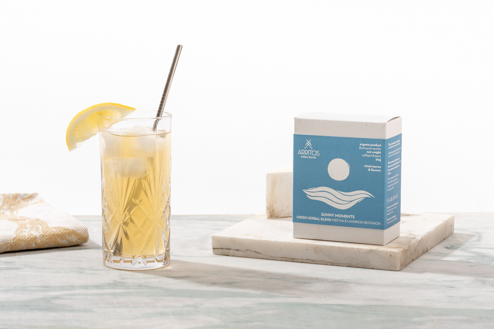
Through the new packaging for Arritos we sought to present a creative, economical and practical solution. Regarding the design direction we followed, Arritos asked us to create packages that would highlight the character of each mixture and would inspire the tea drinker to try them hot and cold. We decided not to show the product through a cutter as this would alter the quality of the content. We created illustrations that are inspired by each product, not by the ingredients, but by the experience. At the top of the package, in addition to the embossed Arritos symbol, you will also find Braille characters for the visually impaired. In terms of materials, avoiding plastic in the whole package was one of the goals of the brand and ours. At the same time, we selected recycled and recyclable papers.